
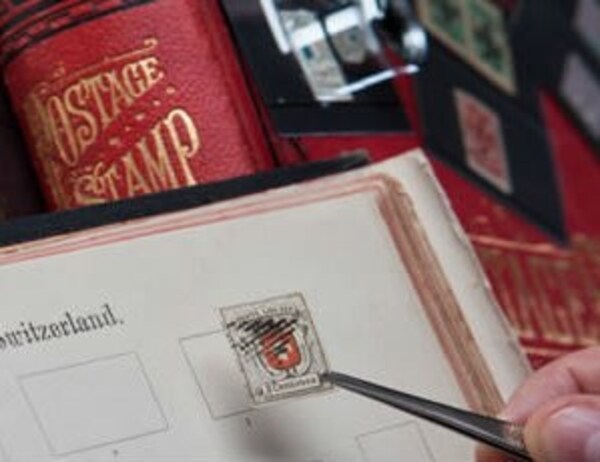
Is This The Worlds Best Stamp Design Error?
Why do we love stamp errors? Whether it's those missing & incorrect colours, inverted centres (or centers, to our American friends) and those other high profile stamps beloved of the price guides and auction catalogues. For whatever reason philatelists have chased them for generations, even before the hobby moved toward what was loosely named the "French Method" in the early 20th Century, where sketches, essays, proofs and all manner of 'background' material became essential to the serious collection and exhibition offering.
But there is another class of error (generally much cheaper to own!), those wonderful stamps we can group as 'design errors' where the designer and postal authorities just got it wrong. Often the error is spotted after the stamps issue and nothing is ever done to correct it as it is simply too late, and the stamp passes into philatelic folk law.
A couple of well- known examples would be the 1903 St Kitts-Nevis definitive's which show Christopher Columbus viewing the New World through his telescope, very many years before such a device was available to him! Or perhaps the Monaco 1947 Stamp Exhibition stamp that shows President Roosevelt with six fingers?
Below is our current favourite, it's the 2007 5k35 "Minimizing iliteracy" stamp from Papua New Guinea – you will note that they spelt "illiteracy" incorrectly…
 General
 General
 General